A Brief History of Web Design & Usability
In the early days of designing and building websites there were very few conventions to follow; everything was new, exciting and uncharted. Elements that we are now familiar with on the web, like search boxes, buttons, headings, navigation, layouts and logo positions were often interpreted & presented in a wide variety of new styles, some good, some not so good- standards had yet to be set. The web was a difficult place to find your way around; a dark room full of unknown signs, signals and doorways.
Usability in Life
Imagine if we’d never seen a door handle before? Or a television remote control? How long do you think it would take to learn all the features we so readily take for granted in our everyday life? The answer is that although you, the user would undoubtedly work out how to change the TV Channel, for many it would only be after the unfamiliar controls had been thrown across the room in frustration. Usability and convention are intrinsically linked and as a designer this is critical- we shouldn’t try and reinvent the wheel (unless you can be the one to better it). If it’s your website that is the unfamiliar remote control, I guarantee the user will simply go elsewhere before they even allow themselves the chance to get frustrated, so much of what we do is in our subconscious and if we have to think about things that should be second nature, we will leave.
Let me give you a real life example, recently myself and a colleague attended a weekend of creative seminars in Morecambe named Technique Retreat, one session was run by usability experts James Downes & Dan Zambonini of Box UK. The first question by the speakers was referring to the newly refurbished Art Deco building in which the event was being hosted, The Midland Hotel. They asked how long it had taken us to find and work each of our toilets in our rooms; the answers ranged from 5 minutes all the way to one chap who had been ‘in a hurry’ and had given up and used the sink! He had assumed he’d been given a room without a bathroom! Although the ‘fold-out cupboard’ style bathrooms in question did save space and were undoubtedly fancy; where they gained originality in design they failed miserably at being inherently usable and fit for purpose.
Originality Vs Convention
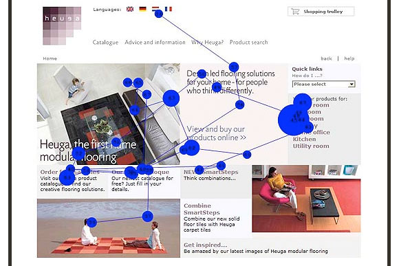
As designers we are always looking to try new techniques and styles, to be cutting edge and to set trends. However I also understand that whilst it’s good to push the boundaries of our work, it is also vital not to alter those elements that the user will subconsciously identify and find reassurance. When a user views a web page, they actually don’t ‘read’ it at all, they ’scan’ it; very quickly and usually just to find what they are looking for, or a link to it. If they don’t find it they will quickly disappear, so making websites intrinsically usable is critical. Eye Tracking technologies have highlighted much of this ’skimming’ user behavior and are very useful in helping us designers understand how our sites are used and received. See diagram below: It clearly shows where the user’s eyes have looked and for how long.
Conventions don’t have to be boring and can themselves be open to creative interpretation. The simple navigational ‘tab’ is a good example of a convention that is open to originality of design. Amazon first used the tab and since then it has spread and been implemented in many; often beautiful ways. They create depth and space in a page, they’re clear and we are all familiar with them and inherently know how they function (through their use in real life) . They also have clear ‘on’ states to let the user know exactly where they are at all times.
So, although we do try to make our websites as original as possible, there are many rules we shouldn’t break. As Stev Krug says in his book “Don’t make me Think”: “Conventions are Your Friends”.

Designing for a Usable Web- UCD User Centred Design
There are a great many techniques and processes involved in the design and building of a good, usable website. Here at Access, before we even think about putting pen to paper, we begin a process of user analysis. Which groups of people will be most likely to use the website and what will each of them be looking for? What features should be afforded them and what page prominence should each feature therefore be given? In recent years I’ve realised the importance of this user profiling, it gives the designers and planners much more substantiated, quantifiable evidence for the purpose, content and suitable tone of voice for the website. And if, as sometimes happens, a client or colleague asks if they could have a feature you believe may not be suitable; you have evidence, not just your subjective view or professional opinion. No longer do we design first, ask questions later.
Gradually from the user analysis, a site map should begin to form. The content and navigational structure of a website will end up being as crucial as the design itself. Information architecture is critical, should be intuitive concise and not too deep, with a clear breadcrumb to return the user from whence they came.
When designing a page, one technique I often use to ensure page ‘noise’ is down to a minimum and that content is defined into clear, areas or *’blocks’ of content is to stand back from the page and squint my eyes to blur my vision; I should still be able to define each block and what it contains. A rudimentary but useful technique.
*A term commonly associated with Drupal Open Source CMS- of which myself and Access are purveyors and huge fans.
It’s vital to create a clear visual page hierarchy to a design so the eye should naturally flow (or skim) through the page from most important to less essential content. The use of clear branding, bold, sizable headings (with incremental size reduction flowing down the page), colour, font size and ensuring links and buttons look obviously click-able are all conventions that help achieve this page flow. Not to mention the importance of omitting needless words, images or filler content.
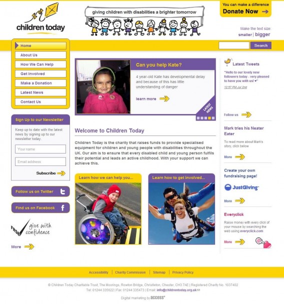
Usability isn’t just about what you see though, a site can’t be called usable until it’s accessible to all. Good, clean mark-up, ‘alt’ tags, scalable text, titles and proper descriptive headings are just a few of the essentials. We recently launched a new website for Children Today; a charity supporting children with disabilities and helping them overcome these with new, essential equipment. When you see the success, reach and impact of a site like this you realise the importance of accessibility as well as usability for all.

Usability Testing as a Common Courtesy
The benefits of Usability testing cannot be exaggerated. Every time a site is tested; big or small, invariably you learn something new and completely unexpected from the user. This can then be used to refine the structure and design accordingly. The more often testing is carried out, the more usable a site will be.
It can be as basic as asking a friend (my flatmate gets nominated regularly- thanks Dave) to perform a few tests and to simply observe the results or ask them to talk their way through their actions. Alternatively, much more detailed, recorded studio tests performed by a third party and a large number of users can prove to be invaluable. The new Website for The Office of Fair Trading which we launched in early May is a good example of thoroughly tested site. With results being recorded, interpreted and fed back into production all the way through development to achieve a clean and transparent user experience.
And finally…
As much as we love to break the mould and strive for websites of distinction we must remain focused on the clear delivery of content and site functions first, our designs should then evolve from this process. More and more I see websites whose designs have come before the user experience and often fail to then function with the clarity they are intended to.
It’s a pleasure to work in an environment where thoughtful processes, planning and user experiences are evaluated and appreciated as much as the finished design and hope this is reflected in the shiny, happy faces of the end users.


